Flexbox is to give the container the ability to expand and Shrink elements base on the available space. Flexbox Layout replaces float Layout Design New way to build one-Dimensional layouts.Flexbox prefix when writing CSS code.
display:flex;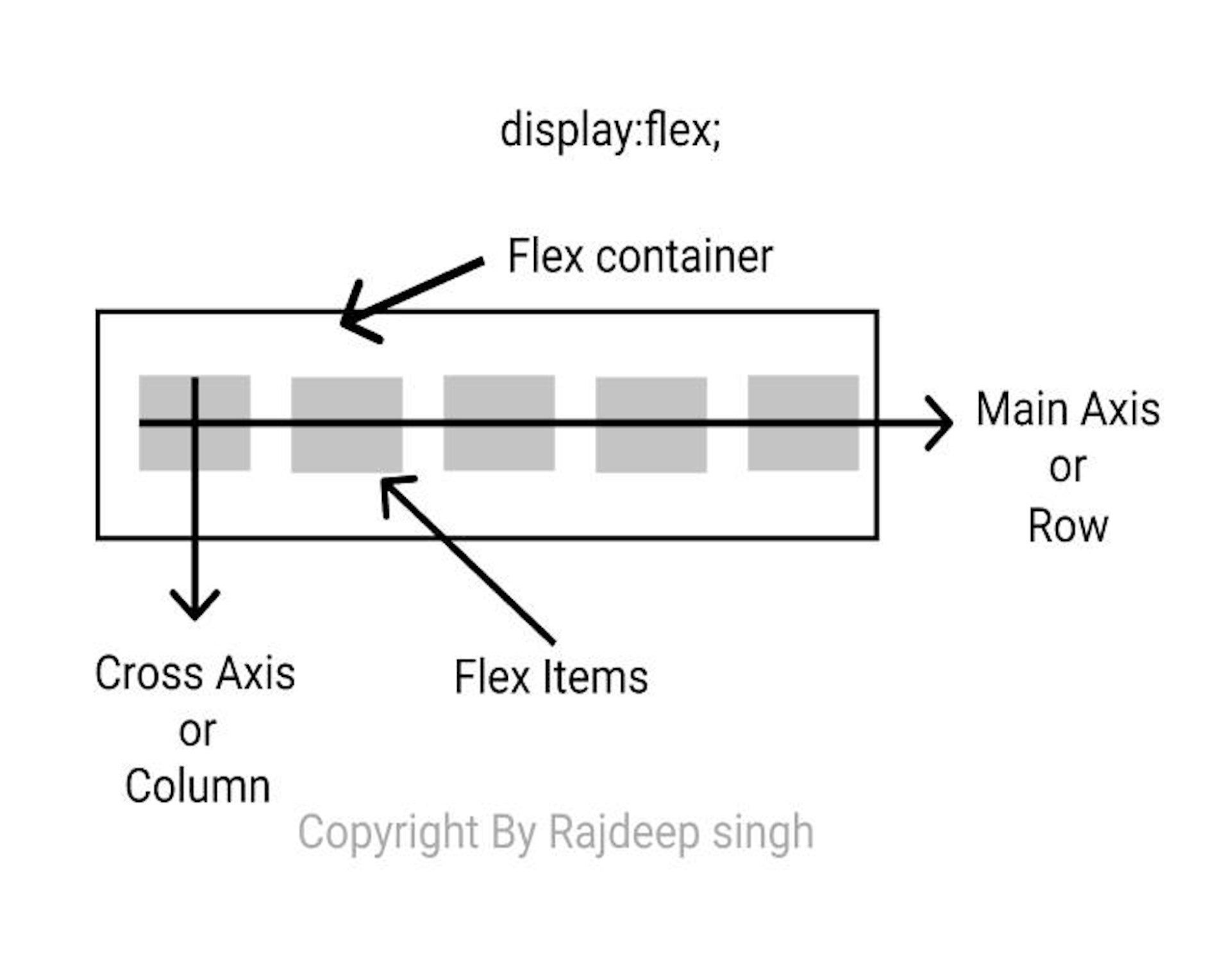
let start it
flexbox properties:
- Flex-direction
- flex-wrap
- flex-flow
- flex-grow
- flex-shrink
- flex-basis
- flex
- justify-content
- align-content
- align-item
- order
1.flex-direction
Is use flex-direction on the website on flex-direction provides direction row or column-wise.
Properties value:
- row (Default): use Horizontal to direction item to Left to Right
- row-reverse: use row reverse to change direction to Right to left
- Column (vertical): use Vertical to direction content item top to bottom
- column-reverse: column-reverse reverse the direction Bottom to top
Note: Do Not work with inner item
.flex-container {
display: flex;
flex-direction: column;
/* flex-direction: row; */
}
2. flex-wrap
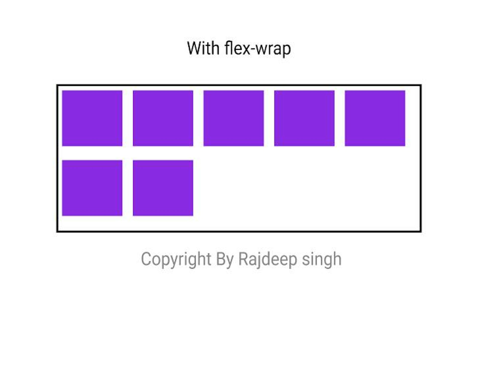
some over content overflow in that condition use flex-wrap
flex-warp property value:
- nowrap: nowrap is the default property.
- warp: try to align the item in the given weight and height.
- warp-reverse: warp-reverse reverse the order of the item.
.flex-container {
display: flex;
flex-wrap: wrap;
}
3.flex-flow
The flex-flow shorthand of the flex-direction and flex-wrap.when using in CSS file:first, use flex-direction after use flex-wrap.Syntax:
flex-flow: flex-direction flex-wrap;.flex-container {
display: flex;
flex-flow: row wrap;
}4. flex-grow
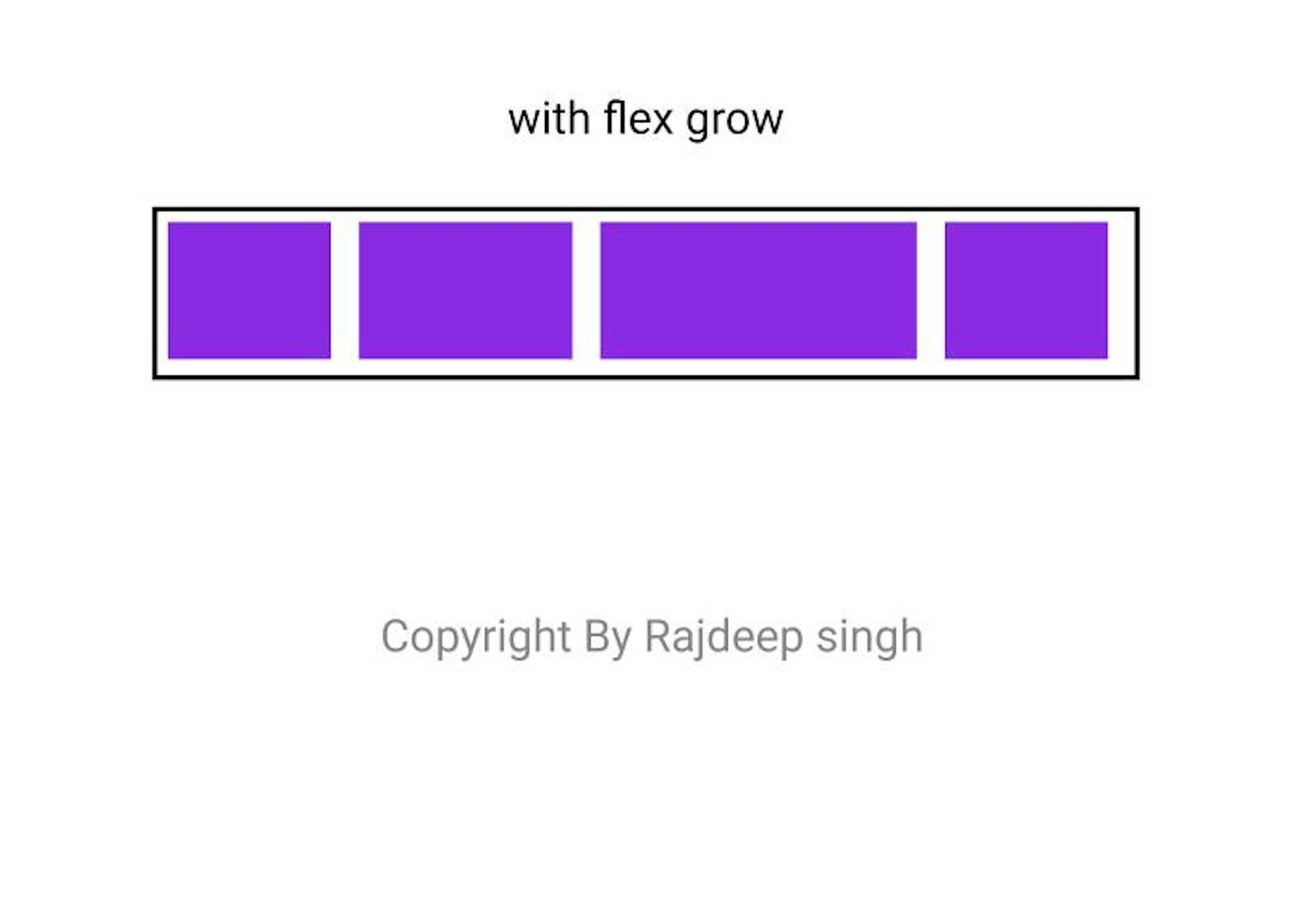
Flex-grow work on the child item, not a parent item. Flex-grow gives equal space and also works on weight.
syntax:
flex-grow:1;The flex-grow gives value base on a number like 1,2,3….n.
<div class=”flex-container”>
<div>1</div>
<div>2</div>
<div style=”flex-grow: 2">3</div>
<div>2</div>
</div>
5. flex-shrink
flex-shrink use to create a responsive web layout.
flex-shrink:0;No work. But when increase value to zero. Then web layout shrink.
<div class=”flex-container”>
<div>1</div>
<div>2</div>
<div style=”flex-shrink: 0">3</div>
<div>4</div>
<div>5</div>
</div>
6. flex-basis
The flex-basic work like max-width.but in max-width fix width size.the flex-basic work with width and space. Note: flex-basis use to the individual item.
<div class=”flex-container”>
<div>1</div>
<div>2</div>
<div style=”flex-basis: 200px”>3</div>
<div>4</div>
</div>
7. flex
The flex property is a shorthand property for the flex-grow, flex-shrink, and flex-basis properties.
.item {
display: flex;
flex: 1 1 150px;
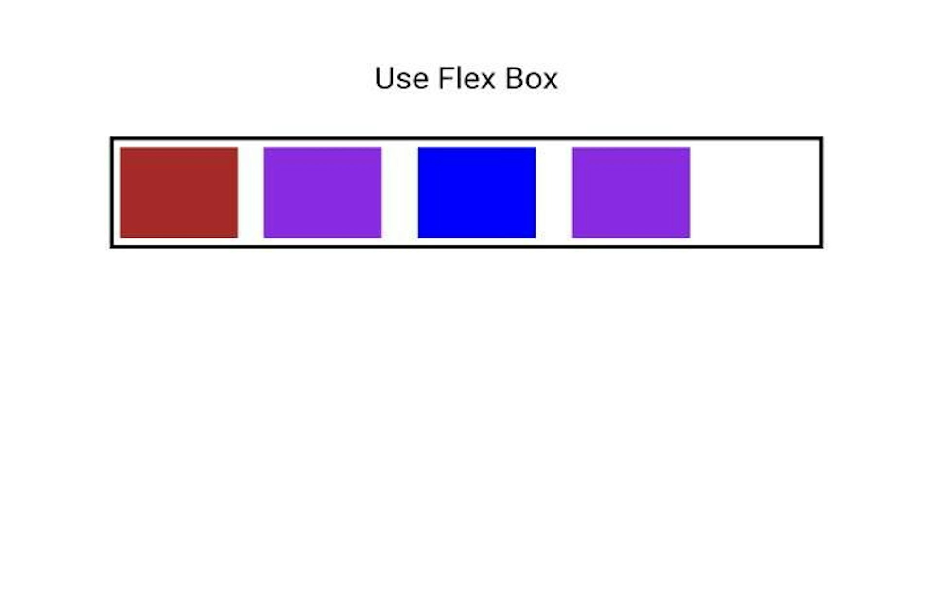
}8. justify-content
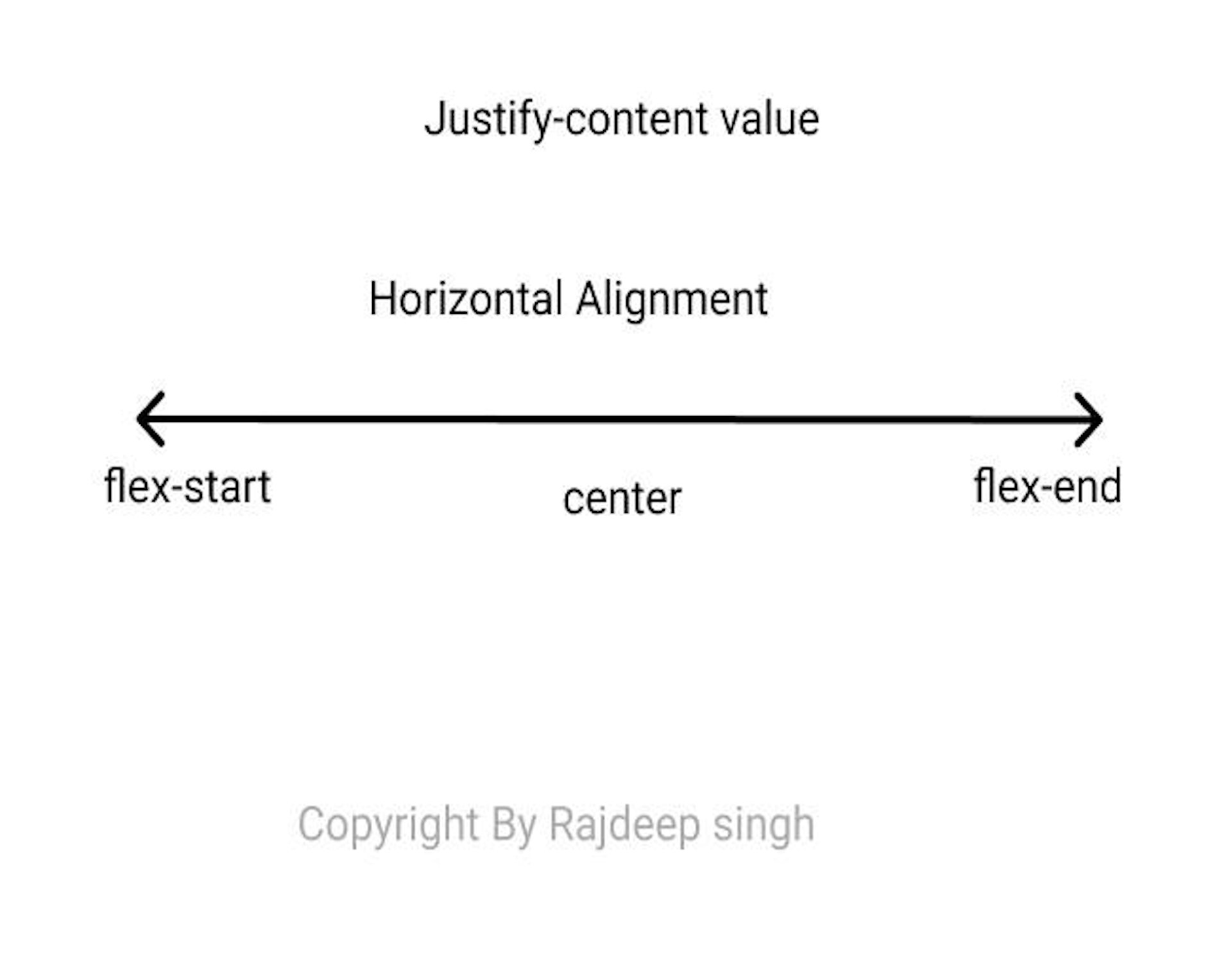
Justify-content properties use for Horizontal Alignment
property value:
- flex-start: all the items more to Lift side
- flex-end: flex-end all the items more on the Right side.
- center: all the items in the center
- space-around: space-around first and end item move to corner
- space-between:
- space-evenly: space-evenly use for distributing space equally for every item.
.flex-container {
display: flex;
justify-content: center;
/* Write all value */
}
9. align-content:
align-content to use align item to vertical. Some time use height and width on the item in that condition data is overflow.
- Stretch: stretch is a default value
- flex-start: all the items more to Lift side
- flex-end: flex-end all the items more on the Right side.
- center: all the items in the center
- space-around: space-around first and end item move to corner
- space-between:
- space-evenly: space-evenly use for distributing space equally for every item.
.flex-container {
display: flex;
align-content: space-between;
}
10. align-items
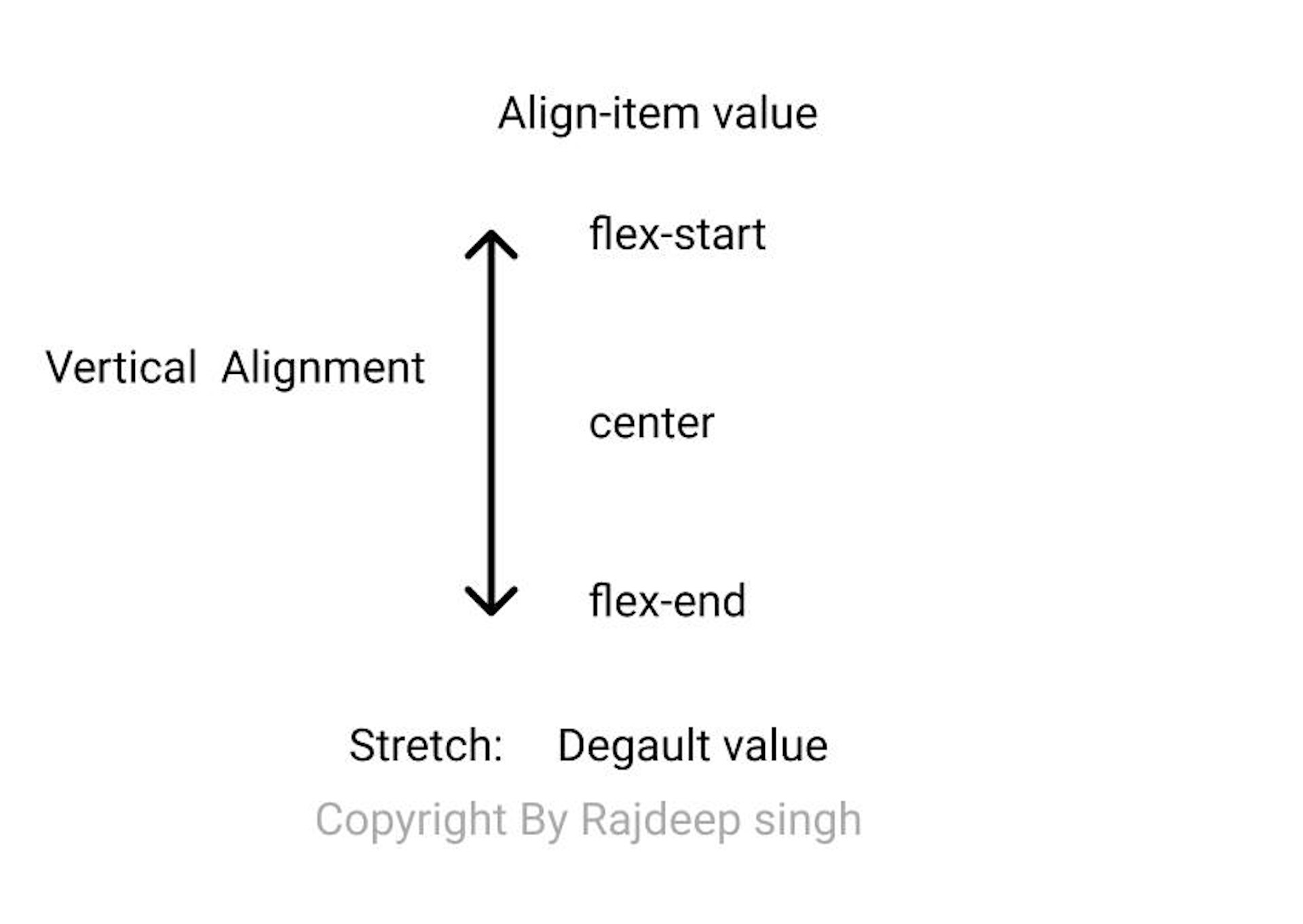
Align-self use to the individual item. Align-self align item to vertical item.
- Stretch: stretch is a default value
- flex-start: all the items more to Lift side
- flex-end: flex-end all the items more on the Right side.
- center: all the items in the center
- baseline: baseline work with your font
- auto: work according to parent
.flex-container {
display: flex;
height: 200px;
align-items: center;
}
11. order:
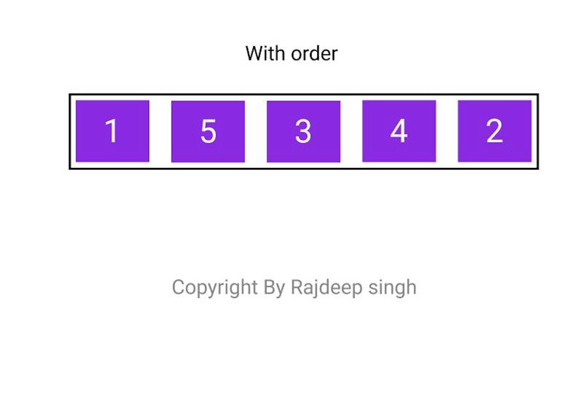
When using the order property in the flex-box. Use to order change the item order according to your requirement.
order: number;<div class=”flex-container”>
<div>1</div>
<div style=”order: 5">2</div>
<div>3</div>
<div>4</div>
<div style=”order: 2">5</div>
</div>use margin property enhances your work.